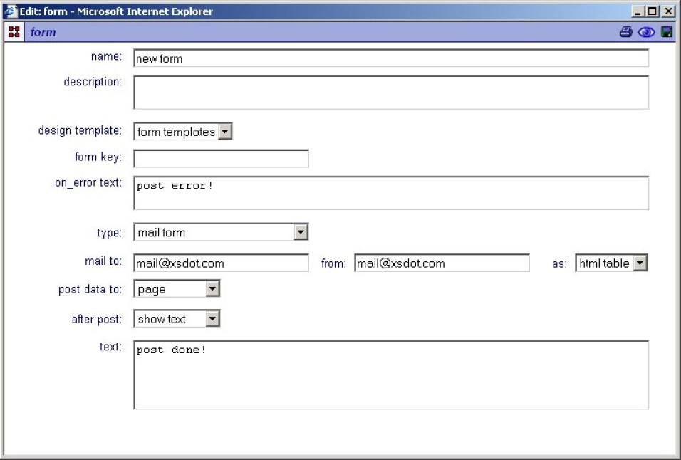
Form component

Building a form starts with a 'Form component', it serves as a framework for the form elements. It is possible to place multiple forms in pages, panels and other forms.
The 'Input components' (controls) are grouped by a 'Form component' and submitted by a 'Form submit component'.

Settings:
Name
The name of the form, this name is used as the form 'key' unless a 'form key' value is specified.
Description
Description text of the form.
Design template
If available, specific form designs can be selected here.
Form key
This is the 'technical' form name and is optionally used for application and database forms. When the form key is blank, the forms 'name' is used as key. Beware that when multiple forms are placed in one page that this key must be unique for the form to function correctly.
On error text
This is the text that is presented to the user when an error occurred on form post.
Type
Specifies the form type. The following options are available,
- Mail form, the form is mailed to a mailbox.
- Application form, the form is posted to an application.
- Database form, the form is posted into a database.
[mail form options]
mail to, the e-mail address to where the form data is sent.
from, the reply e-mail address.
as,: send the form data as 'html table' or as an attached 'xml file'.
[application form options]
post to application, the application that receives the posted data.
[database form options]
post to table, the table that receives the posted data.
Post data to
Controls to where the data is posted,
- Page, the data is posted to the page item.
- Form, the data is posted to the form item.
After post
Specifies what happens after post,
- Show text, shows given text (in text box).
- Go to item, goes to the selected item.
